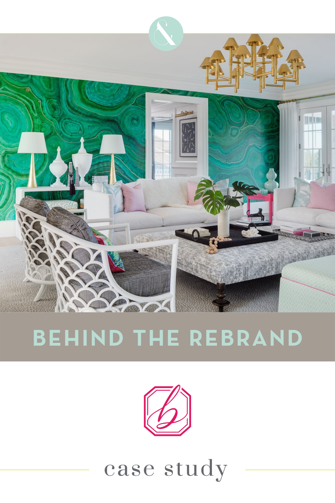
Blakely Interior Design went through a rebrand in 2019 with Pop & Grey. Their initial wish list was for a logo tweak and a new website, but the thought of a new brand hadn’t really crossed their minds. In collaboration with Deb Mitchell Writing, we dug into what makes Blakely tick, and what we found led to a full rebrand, robust custom website and a tagline that encompasses their company culture and has changed the way they think about and communicate their message.
Here, we’re going to detail some of the messaging and visual work we did for the Blakely Interior Design rebrand and website. Watch a candid interview with Janelle Photopoulos and get her take on what the process was like and what kind of results she’s seen since launch.
CLICK HERE TO VIEW THE FULL BLAKELY INTERIOR DESIGN BRAND
The strategy portion of every project is always enlightening and sets the foundation for what each brand needs to communicate. What stuck out to me in Janelle’s workbook and strategy session was her business and marketing savvy. I knew before we started that she would be insanely creative. But I didn’t expect her to have such a well-documented, amazing client process and experience. We figured out early on that while we needed to show Blakely’s creative edge, we needed to make sure their process was just as well documented. We needed to attract ideal clients that wanted the beautiful home as well as a more corporate type A personality that appreciated the support Blakely provides. To communicate all that we needed to in this brand, we had to make sure each piece spoke volumes. We knew bold colors and edgy patterns would have to be countered with a sophisticated, structured, even a little bit preppy feel.
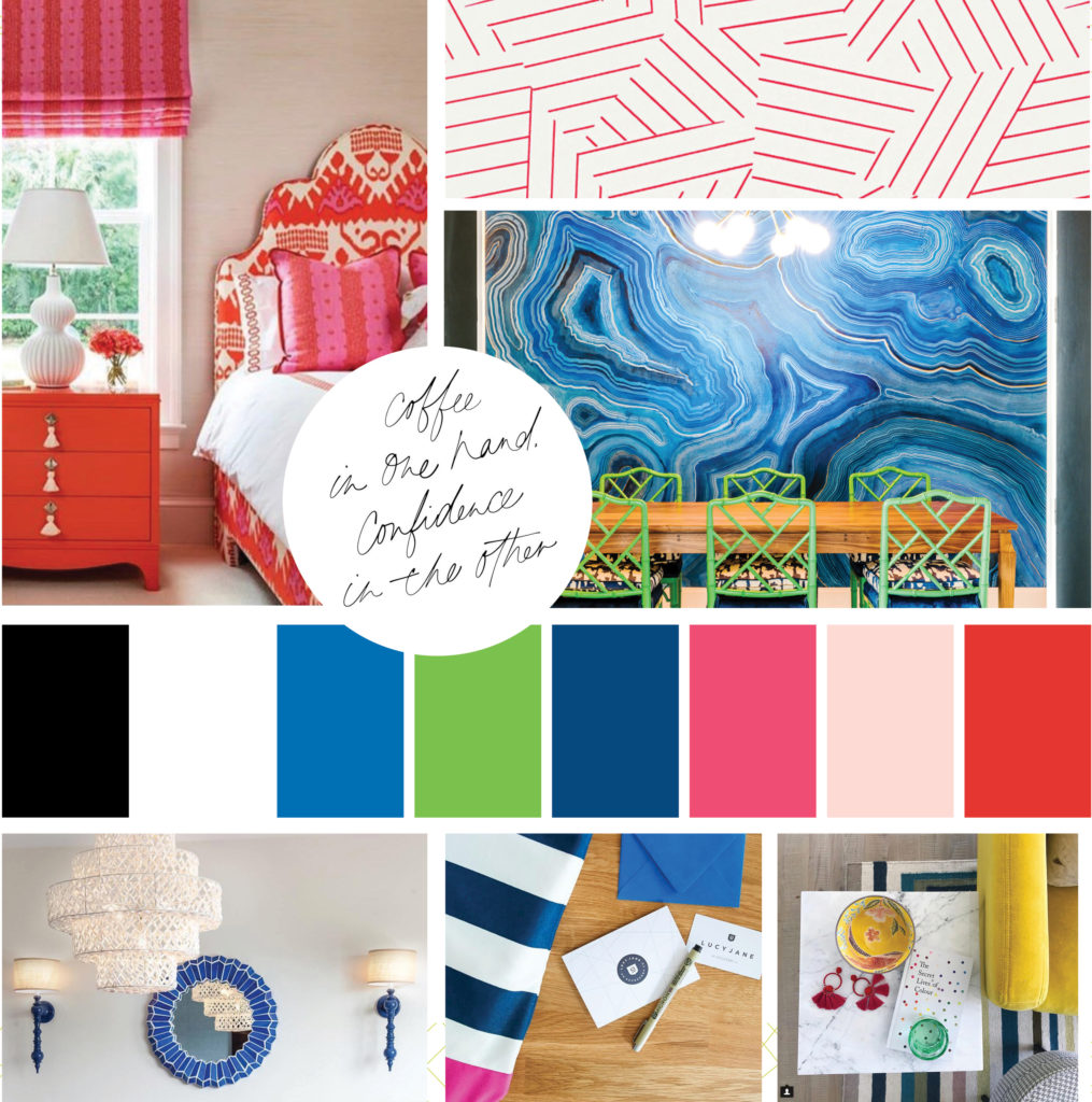
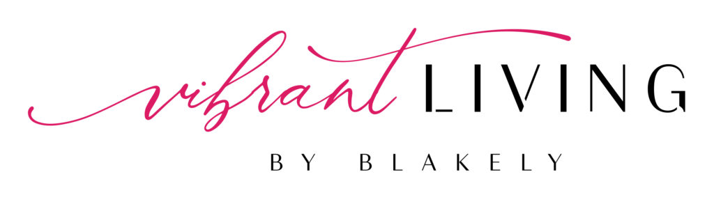
Janelle and the Blakely team already knew their clients were drawn to their bold but sophisticated design aesthetic, but they had never focused on that in their messaging, instead relying on their portfolio to sell for them. The biggest takeaway through this process was giving them a foundation for their messaging. When we landed on the tagline “live vibrantly,†we all knew it was something special. Not only did it connect emotionally with their audience, but it also gave them solid footing for all of their content creation moving forward.

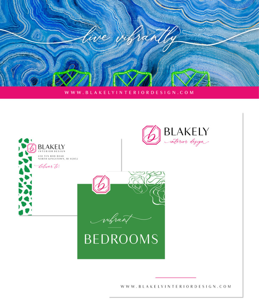
The tagline was a snowball for the rest of the brand. Their old logo, while beautiful, felt dainty and feminine with a script B and watercolor accents. Soft watercolor was in direct contrast with their bold, vibrant messaging. Rather than scrapping their recognizable look altogether, we decided to keep the bones of the script B but make it communicate the right message instead of conflicting with what we wanted their brand to say. I can safely say that I did more versions of this logo before settling on the final concept than any logo in history! We had to find the perfect balance between a sophisticated script B, vibrant color, a solid border, and a bold, contemporary font treatment….no easy task. The new logo feels like a fresh step into the future for Blakely Interior Design rather than a new, arbitrary direction. Their logo design was specifically created so that Blakely could become an umbrella brand for sub-brands like furniture, wallpaper, and anything else they can (and will) dream up over the years.
Because Blakely had so many plans for the future, we created several different variations for their logo so that they had a softer version with a script font and an all sans serif contemporary version.
A rebrand has a job to do, and it’s not just to be a prettier version of the old brand. The job for the Blakely Interior Design brand was to position it for their future goals. Goals like attracting clients that love their fearless design style, pattern mixing, and vibrant use of color, while also positioning their firm as experts in design with a buttoned-up, no stone left unturned process. It was imperative that their website supported all of their content and even future goals of an e-commerce store that would reflect the Blakely aesthetic they’ve established.
The original homepage was nice looking but didn’t guide visitors on any kind of journey and push them to learn more. It also made the mistake so many interior design website make of not including any copy, which can really hurt search engine optimization. We set out with the goal of educating Blakely’s potential clients and delighting their visual senses at the same time.
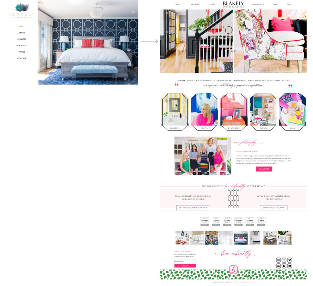
The website needed to do the job of educating them on what it’s like to work with a designer of Blakely’s caliber and immersing them in their bold world so that they know exactly what to expect before they ever pick up the phone. The other function of their website is to support the future goals of an e-commerce arm of the business. Blakely’s brand and the website were created with future e-commerce in mind so that when the time is right, they don’t have to reinvent the wheel to add an online shop. The website has a lot of information and to make sure the customer journey was a good one that kept people clicking, we made sure it would surprise and delight at every turn.
We decided as we were working on the site design that the Blakely blog really deserved an identity of its own. Janelle and her team were committed to creating consistent content, and it needed a place to live that would position them as the design influencers that they are. Their blog also serves to pre-educate potential clients. This was the perfect use for the versatile Blakely logo. We titled the blog “Living Vibrantly by Blakely†and gave it a sub-brand look that is cohesive with the overall feel of the larger Blakely brand while giving it some legs of its own.
The custom touches we added to the Blakely website portfolio are some of my favorite pieces of this project. At first glance, the portfolio page isn’t that different from many other designers. But upon rolling over any of the featured project images, you see a bright pop of magenta that changes to shape of the logo that is uniquely Blakely. And then you notice the filtering options that let viewers choose to view the stunning photography by color, rather than just by project. For most brands, I would deem this a fun little touch that is sort of fluffy and unnecessary. But for Blakely, it’s a huge benefit because we know what their clients want. Their clients love color, and it wouldn’t be unusual for them to want to dive into inspiration images based on colors that they’re drawn to rather than just a room or a project name that means nothing to them. A custom site allows you to do little things like this that can have huge impact.
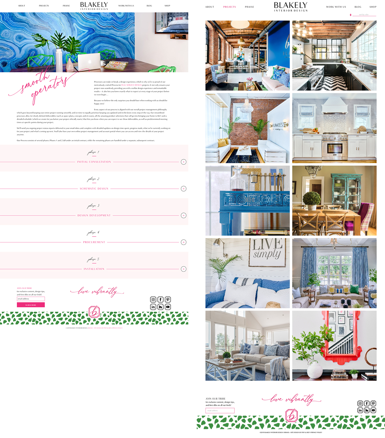
Another custom touch to their website is the process page with accordian designs that walk potential clients through their process in a fun, interactive way. It allowed us to include a lot of explanation and copy without overwhelming the eyes with huge blocks of copy.
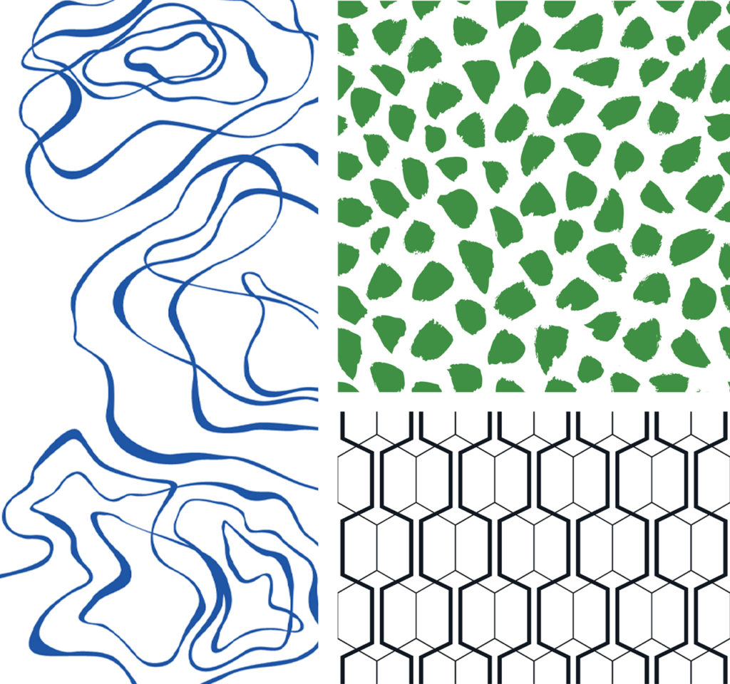
The Blakely brand has 3 distinctly beautiful, unique and bold patterns that we used throughout their materials. We knew from the start that these patterns would be key to many of their designs. We kept the logo cleaner and simpler so that in combination, nothing would get too busy. Brand elements made it easy to keep building the brand through print and digital collateral materials. Because the patterns were so detailed and bold we couldn’t use too many at a time, but it was a great way to differentiate different collateral materials so that nothing looked the same, but it all had a cohesiveness that is recognizable.
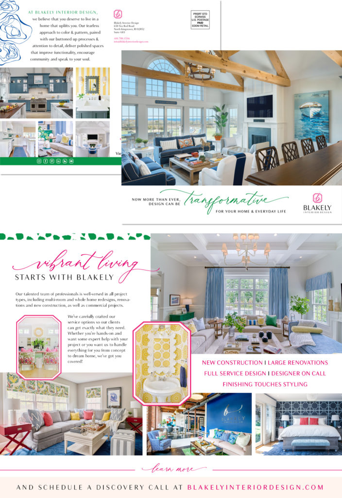
The variety of colors and patterns used in this brand allowed us to create collateral materials that felt creative but also cohesive. Over the years, we’ve created more and more pieces for Blakely including print pieces like business cards, notecards and mailing labels, digital materails like a Facebook cover, a Youtube cover, and Pinterest board covers and marketing materials like direct mail pieces and brochures.
This project is chock full of beautiful details and strategic work. We can’t possibly show everything that went into building it, but if you’d like to learn more about how we worked with Blakely Interior Design on their rebrand and website, WATCH OUR CASE STUDY INTERVIEW with Janelle where she talks about the what the process was like and what kind of results she’s seen in the almost 2 years since launching.