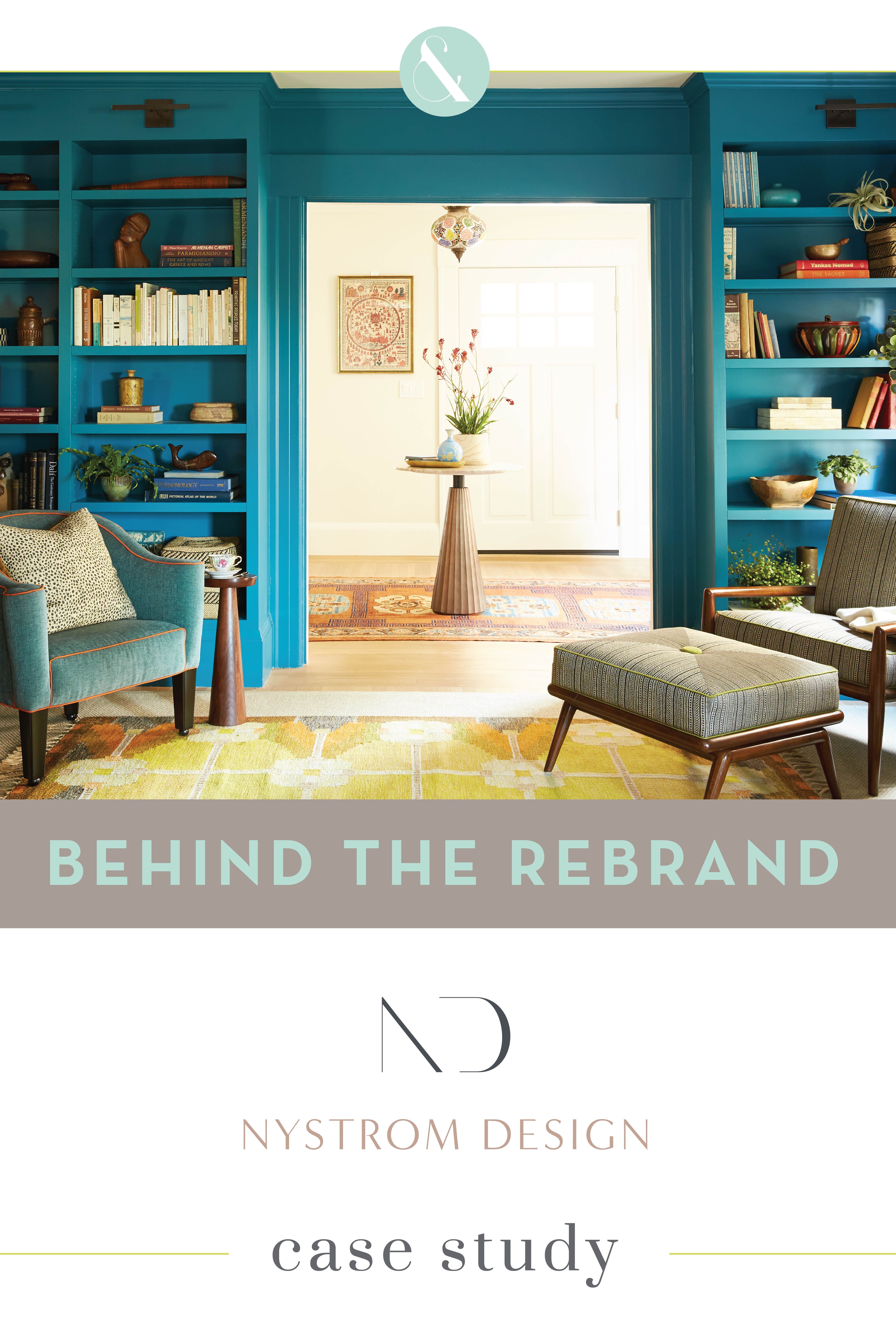
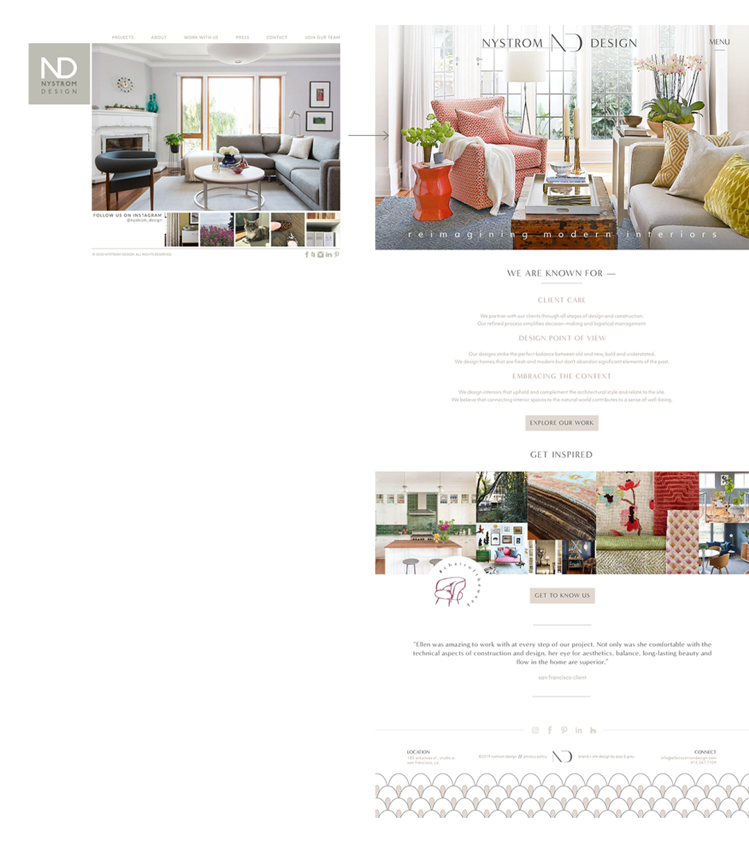
Nystrom Design decided they were ready for a rebrand at the 10-year mark. What a big milestone, and the perfect time to reassess the growth of their business, changes in their audience, design skill and client process. In collaboration with Deb Mitchell Writing, we set out to really discern the Nystrom Design difference in their strategy session. This brand was a lesson in design restraint, celebrating minimalism and focusing on the smallest details for major punch.
This post details some of the messaging and visual work we did for the Nystrom Design rebrand and website. Watch a candid interview with Ellen Nystrom and get her take on what the process was like and what kind of results she’s seen since launch and keep reading below for a full case study of the Nystrom Design rebrand and website.
Click here to view the full Nystrom Design brand
It was evident that the Nystrom Design aesthetic was warm modernism. It would be critical to make sure the style of their visuals was modern, sophisticated and very clean, but unlike many minimal brands, we also needed to convey a warm, welcoming and very personal vibe. When we create minimal brands, every word, color and graphic holds extra weight because there are so few of them. Because the Nystrom Design brand is minimal but also very warm, there was even more importance to communicate that complexity and depth.
During the brand strategy portion of Nystrom Design’s project, we spent a lot of time figuring out Ellen’s values as a designer and discovered so many good nuggets to differentiate her business from the many other interior designers in her area. There were so many wonderfully meaty things we discussed in our strategy session: the importance of nature and the connection of the inside and outside of your home, creating a rejuvenating oasis, the power of the perfect chair and how it really can change your life, building a narrative for the homeowners, the importance of artwork in your home, among many many other things. One of my favorite parts of every project is that initial strategy session where we can really dig in and talk through the details of how each designer works so differently and what that special sauce is that makes them unique.
One of the first things I knew immediately was that simplicity would be key, and while it was important for her color palette to be mostly neutral, we needed to pull in some really rich, evocative colors from nature in small but meaningful doses.
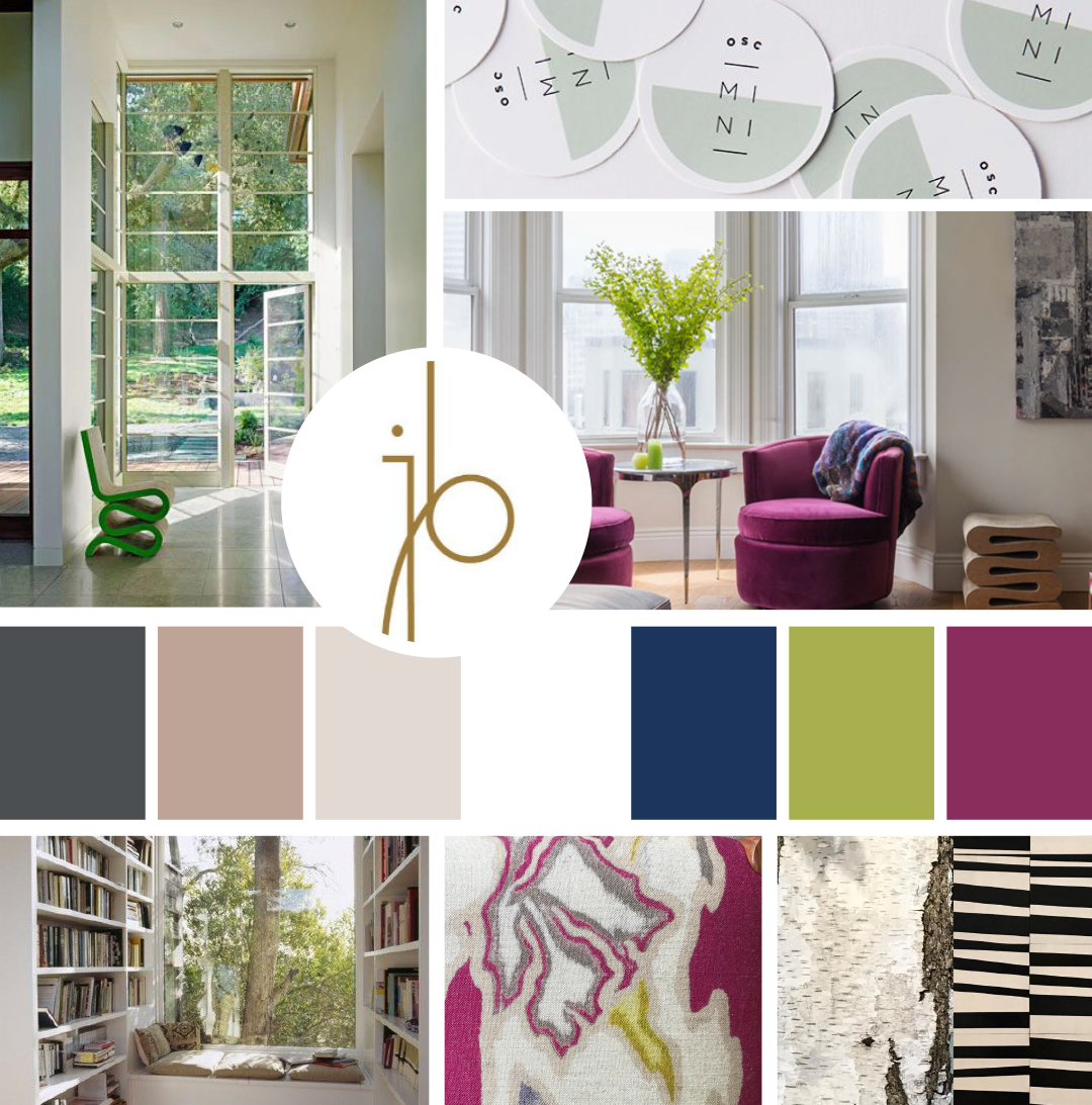
The progress from mood board to logo design is one of my favorites to see. Where we start and end is so personal to each client, and the collaboration that happens makes everything so much better.
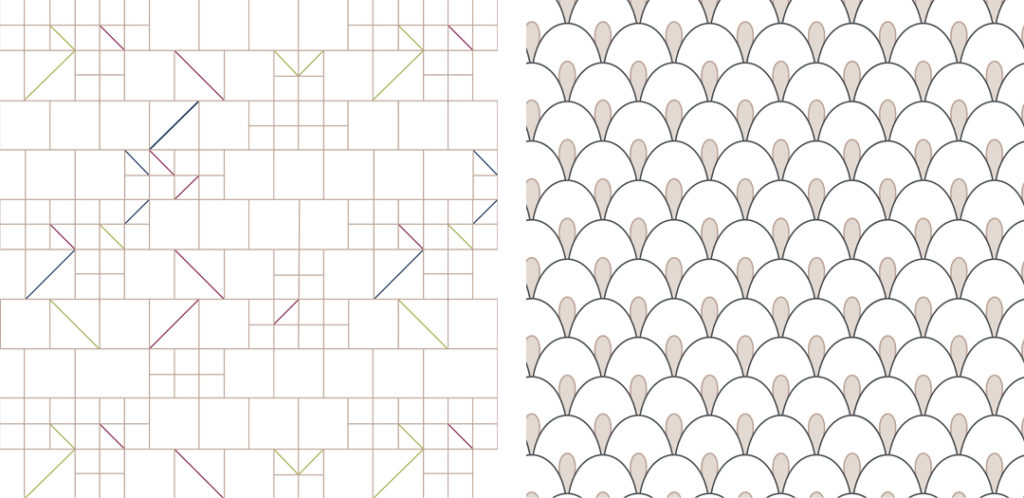
Patterns are almost always the hardest part of any brand design. And for Nystrom Design they felt extra difficult because we needed to communicate so much with so little. They needed to be beautiful but also feel very orderly and structured and unintrusive. Their patterns celebrate the structured minimalism and Art Deco vibe of the overall brand, each one serving its own purpose on its own and in combination with each other.
The majority of the Nystrom Design brand is light, airy and neutral, but we created these colorful submarks that really pack a punch. While they don’t get used often, they’re unexpected head turners that create some emphasis and personality.
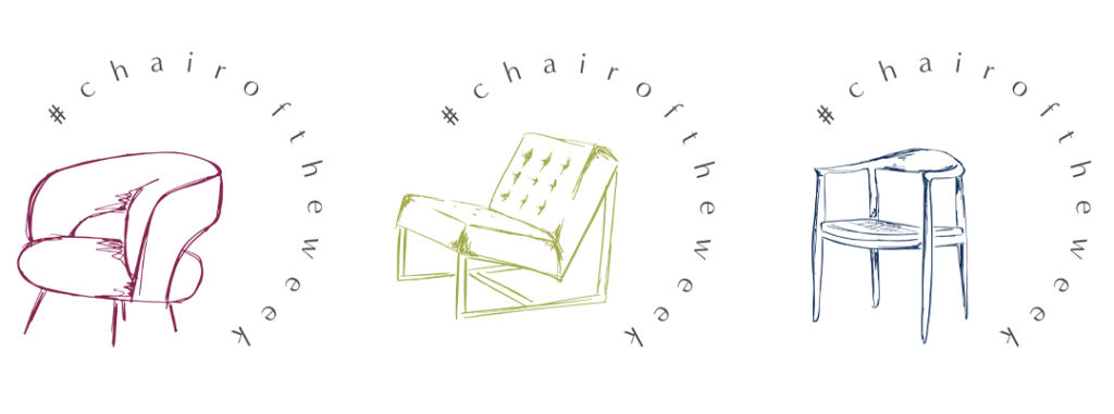
Ellen’s unique ability to see a bird’s-eye view of a project that incorporates what’s inside and outside of the clients’ walls creates a final product that truly supports the way they live their lives inside their home. This was a detail we knew we needed to grab onto and really explore. Nystrom Design had never had a blog before, but we knew Ellen had so much to say outside the confines of just interior design that it was the perfect platform for her to communicate her personality, warmth and depth and weave it into her brand experience. My favorite part of her entire project was creating custom illustrations for each of her blog categories that are sketchy, imperfect and colorful — a stark contrast to her minimal logo and patterns. We pulled this same style into her signature “Chair of the Week” posts that she was already doing on Instagram and brought attention to it through the blog as well.
The transformation of the Nystrom Design website draws visitors right in for a visual feast of beautiful photography and minimal but impactful design. Deb Mitchell had her work cut out for her on copy and messaging, because the website needed to say a lot with very little words. Combined with the copy being a light, neutral color, visitors get started on a calming journey through the Nystrom Design site. The old site had pretty pictures on the home page, but the reversed logo pulled a lot of attention away, and there was no copy to lead visitors on that journey we want them to experience. The lack of copy is a lost opportunity for injecting some SEO and moving visitors to the next page. We always strive to guide visitors to get to know the firm and then schedule a call rather than leaving them to decide on their own where to go.
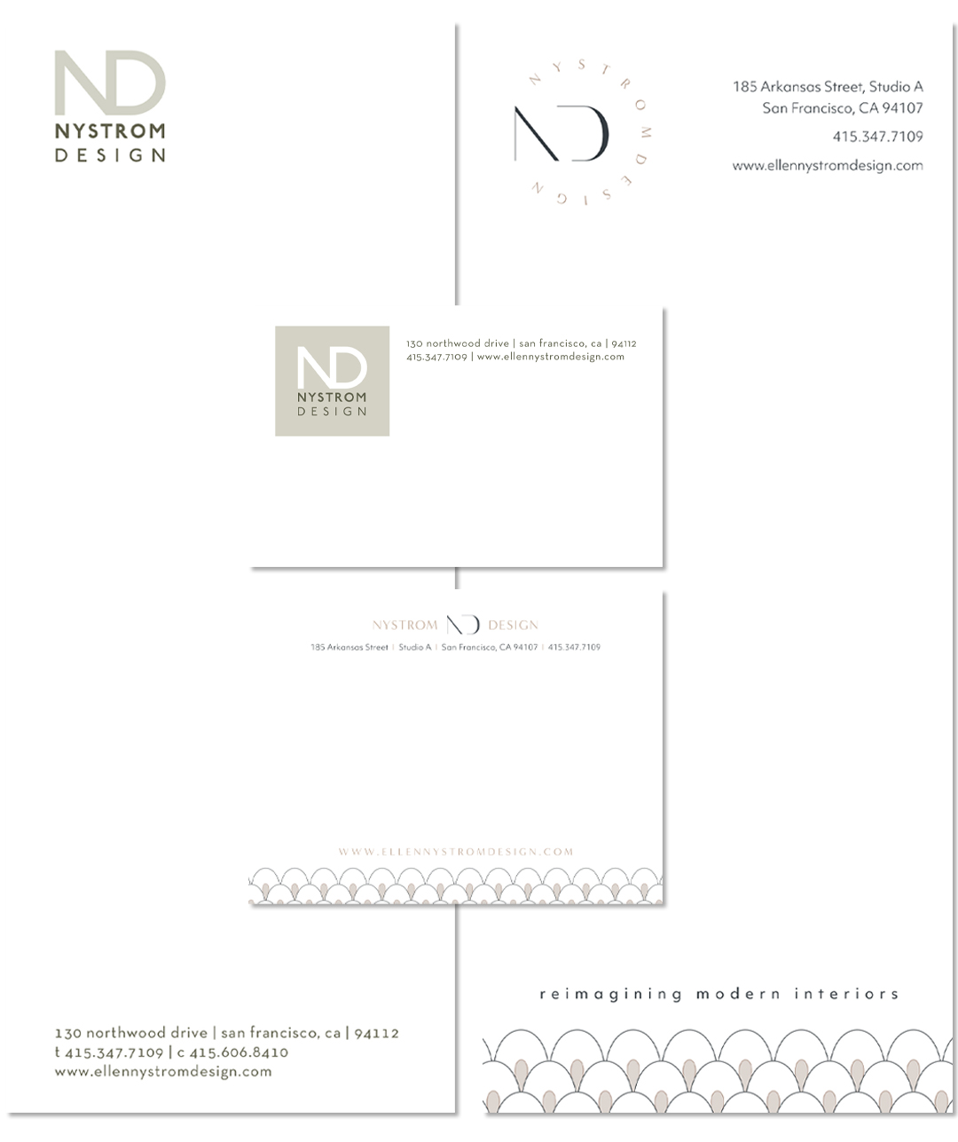
In the same way, Nystom Design’s print materials needed a facelift to reflect the overall brand. Their light, airy, minimal feel is better represented in the new pieces with intentional detailing and softness, as opposed to the heavy logo that felt very hard and imposing on their old pieces.
This project has so many details, it’s impossible to walk through all of them. To learn more about how we worked with Nystrom Design on their rebrand and new website, watch our case study interview with Ellen where she talks about what the process was like and what kind of results she’s seen since launch.