Back in my ad agency days, I prided myself on being good and fast at what I did. I still do, but in the last several years, I’ve had to intentionally de-emphasize the fast part, which is tough for someone who had a deadline of yesterday for every job for the first 10 years of her career. In advertising, that was what the industry and my agency, in particular, demanded, and for the first several years of being my own boss, I thought I had to continue to adhere to everything I learned in the cutthroat ad agency world. I was used to juggling 20+ projects at a time, and honestly, I was really good at it. I still think efficiency is important, but I’d rather my work be spectacular than fast, and the closer I get to turning 40, the more I am acknowledging that it’s truly not possible to be both.
When I first allowed myself to re-examine my process after so many years of operating one way, I realized by being so fast, I was missing an important part of the process. By just jumping on that first creative spark, I was missing the opportunity to explore options and really think. Sometimes the results were still awesome, but they weren’t necessarily meaningful…only pretty for pretty sake. And even more, I was missing the chance to get on the same page with my client before we began designing. In doing so, I was forcing myself to work in a reactive instead of proactive way, which doesn’t benefit anyone and leads to loads of revision cycles to get it right.
What Was Missing?
When I looked hard at my process, I realized that the missing piece was a mood board to make sure we were on the same page before design began. But I wasn’t a fan of the fluffy mood boards I’d seen other designers sharing on social media. To be honest, I rolled my eyes at most of them and felt like more than using them as a tool, they were creating these because it was trendy and fun and gave them a bunch of likes on social media. Clients don’t have the same perspective as a designer, and I knew that just showing them images to dictate the “feel†of the brand wasn’t going to do them any good. I was determined that if I was going to spend my time and energy on mood boards, they would be beneficial to me and my client, and boy oh boy, are they now.
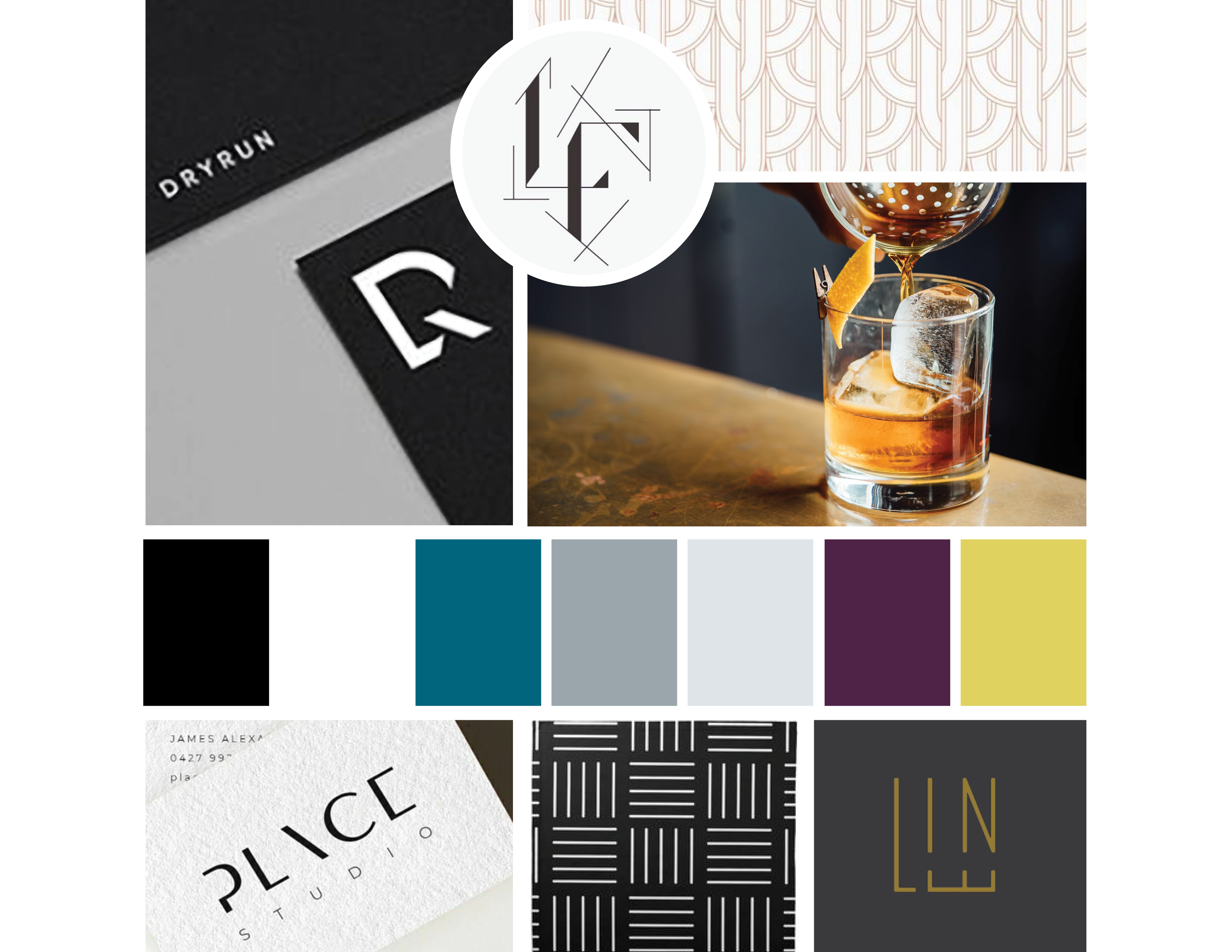
My mood boards are hard-working pieces that define the brand color palette, font style, illustration style, pattern style and more. If I’m going to put in the hours to create one, you can bet it’s not going to be just a few random photos that have the right feel. Mood boards that are based too much on feel can easily be misinterpreted. When I say “soft†or “organic†or “modern” I could mean something completely different than when you say the exact same thing. Because of this, I get really specific with my mood boards.
Our Process
When I work with a client on a new brand, our first step is always a deep dive strategy session. I ask hard questions and get deep insight into their business. After that, I feel fully equipped to begin working on a brand brief that really dissects the foundational strategy of what we’re trying to communicate. Only when the brand brief is complete, do I begin working on a mood board that will inform the creative direction of their brand. I’m not willy nilly grabbing photos off of Pinterest because they “feel†like something that might make sense for this brand. I’m basing my search on the facts gleaned from their brand brief. I begin my search with specific words that relate to their values and customers.
Step One: The Color Scheme
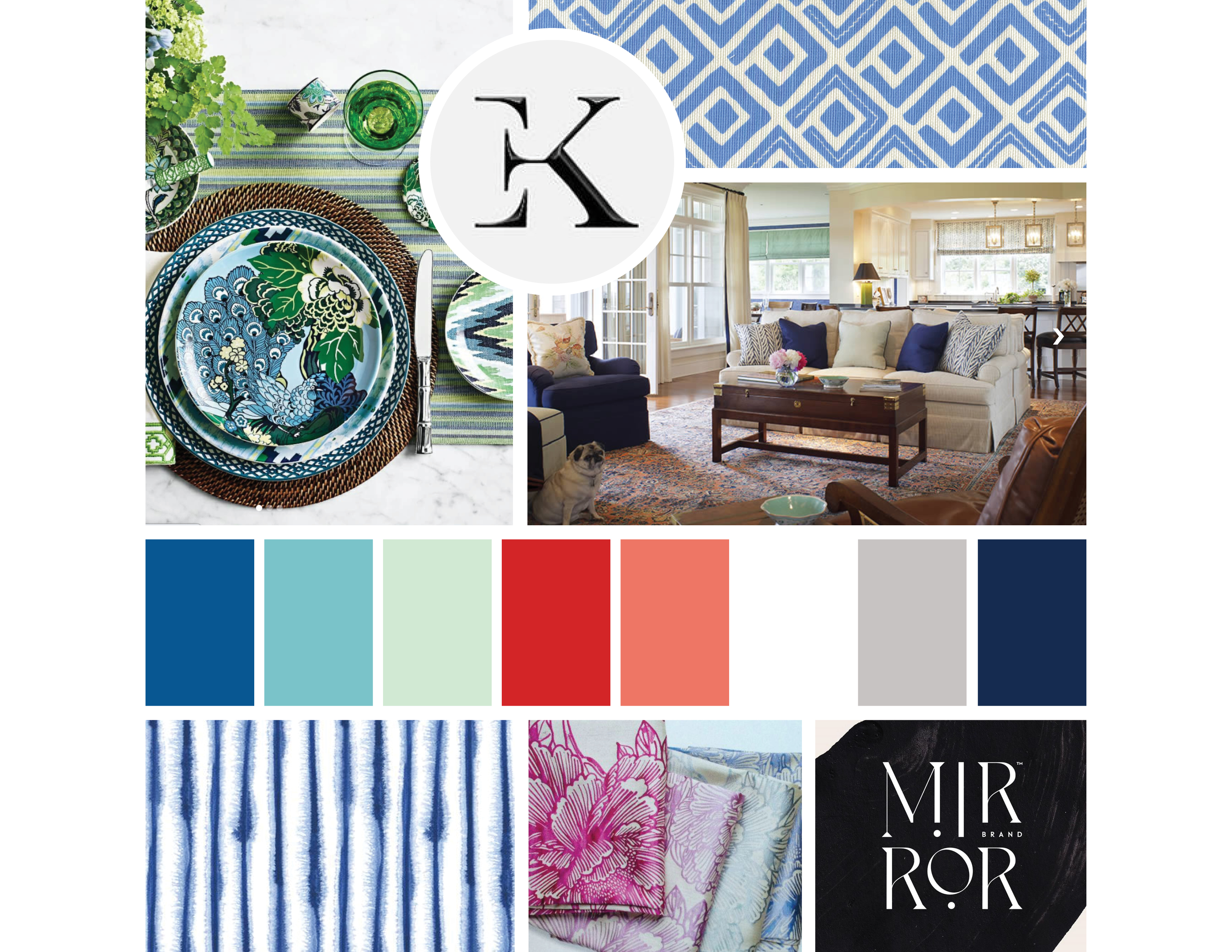
The first step of the mood board for me is always choosing the color scheme. I usually spend a full day choosing colors alone. Sometimes clients are surprised that I don’t ask them their favorite colors before we begin. While I do like knowing if they have strong feelings for or against particular colors, at the end of the day, that’s not the most important part of curating a palette.
The most important part of choosing a color palette is making sure that the psychology behind those choices aligns with their brand values, what their clients need to feel and how they want their brand to be perceived. Colors are a powerful way to get a leg up in evoking the right emotions, but they don’t operate alone, so how you use those colors and the style of the rest of your brand can sway what those colors mean in the eyes of your ideal client. Which is why I start with colors…but there’s so much more.
Step Two: Patterns and Textures
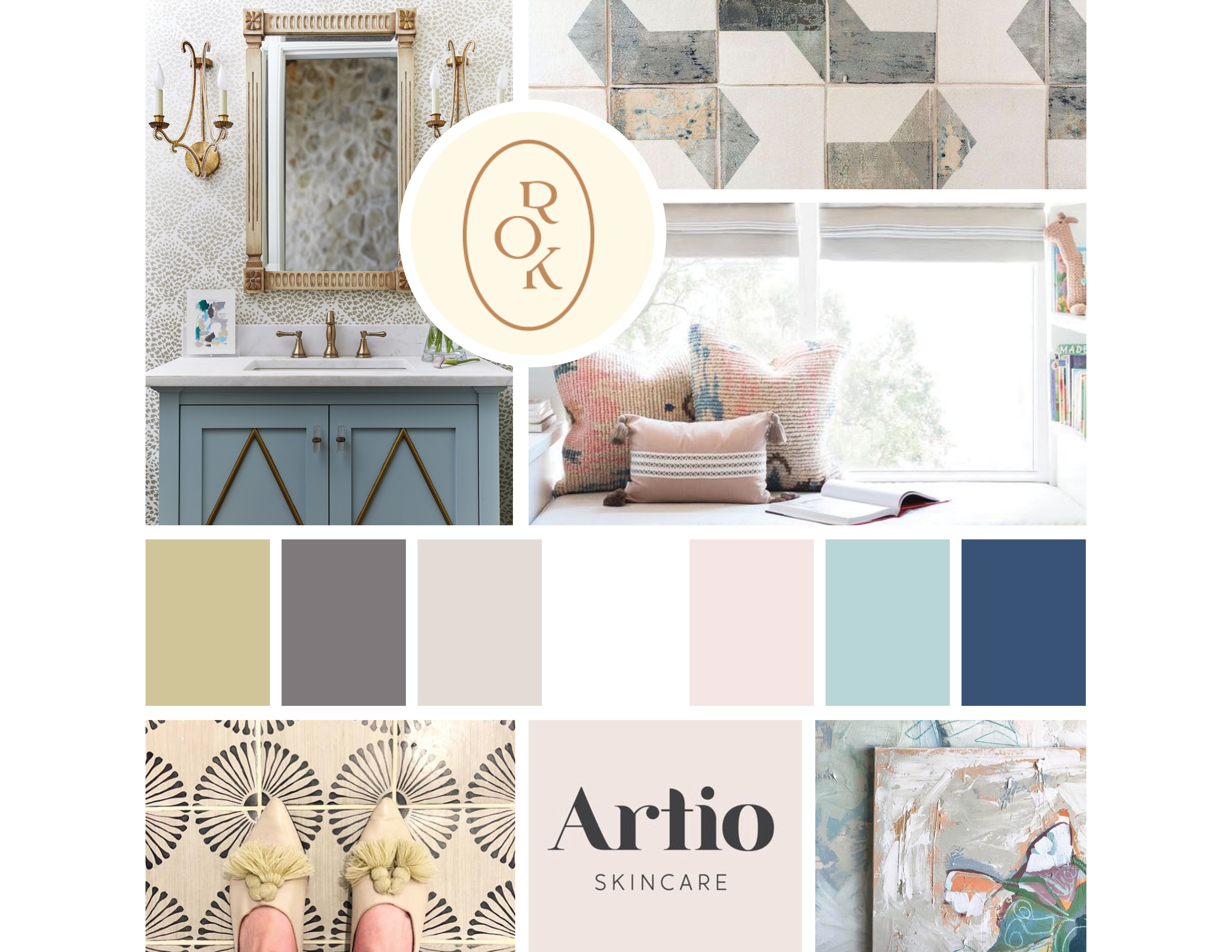
Patterns and textures are usually the trickiest part of a mood board for me. They are my favorite part to design and such an integral piece of the brand, not to mention they take me forever to create, so it’s important that I get the right idea across before I ever start designing. The patterns I show in a mood board are a jumping-off point for inspiration and have a similar style of design for what I’m aiming for, but they’re not a template. You certainly won’t see an exact replica of what’s in your mood board in your final files. Your reaction to what I show in the mood board tells me if I’m on the right track with the style of the patterns I’m thinking of creating.
Step Three: Logo and Font Styles
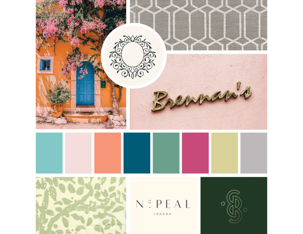
Mood boards always include at least one logo and font example to get a sense of the style I’m going for. This is a really big area where we can’t just use fluffy, descriptive words like “feminine” or “warm” because we don’t all mean the same thing when we use those words.
I typically also include some sort of illustration, especially if we’re planning to create icons for any piece of the brand. The style of icons is just as important as the logo creation, so it needs to be right from the start.
Step Four: Brand Brief and Mood Board Review
One of my favorite days of the entire brand process is when we review the brand brief and mood board together. I love being able to see clients’ faces as we talk through their brand values, ideal client, sweet spot, brand experience, brand voice, and my favorite….visual direction! So many light bulb moments happen in this session.
I find that if you ask a client at the beginning of a project what they want their brand to look like, they usually have no idea. They can tell you a few colors they like and can often pinpoint what they don’t like, but they can’t say what they do. It’s more of an “I’ll know it when I see it†kinda thing. The mood board review process is the perfect way to help them define what they actually like and dislike before I spend hours upon hours going in the wrong direction. When they can see examples of fonts, illustrations styles, textures, patterns, logos and a concrete color palette in front of them, it gets them talking. And you can bet I’m ready with my note-taking then! “I’ll know it when I see it†becomes concrete opinions on all of the things they didn’t think they knew. It also gives me an opportunity to talk through why we should follow a certain creative direction.
We often have great conversations about why even if green isn’t their favorite color, this particular shade needs to be in their palette because of what we’re trying to communicate. It also gives my clients a feeling of empowerment and collaboration in building the brand. I may talk to them about why a shade of green needs to be incorporated, but then they talk to me about why a deeper shade speaks more to them, and it helps me to balance the needs of the brand with the needs of a client to absolutely love what they are putting into the world. This review meeting is the start of some really beautiful collaboration that empowers my clients and makes sure that this brand truly represents them. Not to mention, it also keeps me from going down a rabbit hole and spending days on a design that won’t resonate with my client.
It’s important for clients to understand that what I’ll be designing for them is largely inspired by these examples, but it won’t be a copycat. I spend an exorbitant amount of time trying to find just the right design elements to inform the client about what’s coming without boxing us in to an idea so strict that we don’t get the opportunity to explore creative options.
While I used to think mood boards were sort of a diva designer thing to do, now I’ve learned to utilize them in a way that makes them useful to me and my clients, and the process of creating brands is so much smoother because of it.
Bringing it All Together
When we receive testimonials back from our clients almost every single one touches on how much they enjoyed the creation process. I believe it’s often their favorite part of the project because it challenges them to hone in on their ideal client but then empowers them to grow and shape their brand in a way they feel 100% aligned with. It’s what makes working with Pop & Grey so vastly different than other brand designers.
Interested in this Strategy for Your Business?
Did you know I offer a brand strategy boost that just focuses on the strategy portion of brand creation, goes through all of the same work of creating the brand brief and mood board that my full branding clients do but then lets you take it from there? If you’re not sure about going through the whole shebang of a re-brand and new website but want to see what your brand potential could be OR you want an expert to help you figure out the nuts and bolts of the foundation but have what it takes to take that creative direction and run with it yourself, this might be just the service for you.
Schedule a call here to chat about how I can help.