It’s no secret that I believe your brand is about way more than just the visuals. I speak to the importance of your messaging and strategy often, which you can see here, here, and here. In fact, I don’t even pick up a pencil, yes, I do still sketch before designing every single project (though these days it’s more with an apple pencil than a real one), until all of the brand strategy is complete. That’s when I feel confident in what I need to communicate with the visual identity. Only then do I begin to work on a client’s brand design, including those versatile patterns.
However, even though I downplay the visuals, they are still my favorite thing to create and, in my humble designer opinion, the most powerful and quickest way to connect with your audience.
You might be surprised to know that the logo is actually not my favorite part of the brand to design, even though I get positively giddy over a beautiful logo.
My favorite part of a brand to design is custom patterns. This is where the bulk of my time is spent, and I scrap more than I keep.
Why do I create patterns as part of every brand?

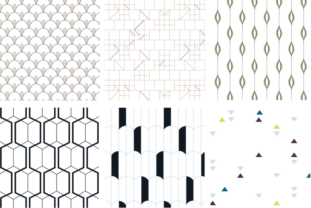
Your logo must be succinct and say so much with so little. It has to be as visually appealing on a huge wall in your studio as it does on the side of a tiny ballpoint pen. Though it is a vital part of every brand design, it can’t communicate everything. This is where your custom brand patterns come in. In contrast to your logo, your brand patterns can contain as much detail as you want, and each yummy little detail speaks to a different part of your brand personality.
When we talk about having a cohesive and memorable brand experience, using a consistent color palette and fonts plays a part, but your brand patterns are the real MVP. They are unique and can create a cohesive identity from print to digital materials. Your ideal client may see a similar color palette elsewhere, but the chances of them seeing your hand-drawn brand patterns anywhere else are next to nothing.
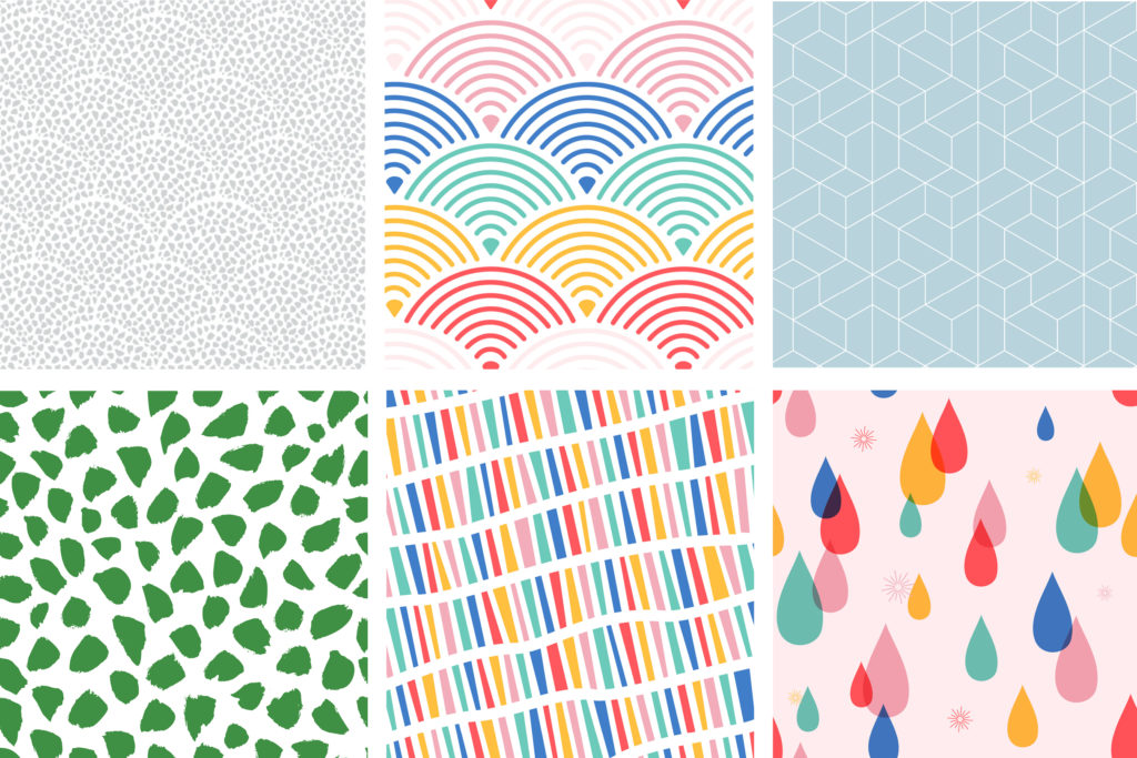
When designing a brand, I always design multiple custom brand patterns. I do this because the personality of your brand has depth and needs to express more than one thing. So, while your logo can convey one feeling, your brand patterns can complement it to create some contrast and balance to show the full depth of your brand personality.
Brand patterns really shine when you’re trying to create a cohesive visual brand throughout multiple platforms without getting stale and boring. When you have multiple patterns, it creates several recognizable elements that all have related styles to illustrate the many facets of your brand. Depending on your particular message on a particular platform, one might be a better fit than another, and it keeps your audience engaged and enchanted with your brand.
Those patterns are instantly recognizable in a sea of social media posts. Be honest, when you’re mindlessly scrolling Instagram, isn’t it a good feeling to know exactly who is behind a post before you even check the handle? That’s what your patterns will do for you, and it’s a much better approach than stamping your logo on everything that isn’t nailed down.
Where to use your brand patterns

I love taking brand patterns and just pulling out pieces of them to use as graphics throughout the brand. The pattern is always impactful in full, but sometimes just a touch of recognizability and color is all you need. Here are some examples of where to use your different brand patterns so they have the highest impact:
- Your print pieces
This is the most obvious place for your brand patterns. It’s easy and makes an impression right out of the gate. They’re even more impactful if you print on luxurious papers that feel as beautiful as they look. Flooding the back of business cards or notecards with one of your patterns is an easy way to make a big statement — it is something that will easily catch an eye when it’s laying in a purse or on a desk.
- Your website
The beauty of patterns is that they are just as stunning digitally as they are in print. Websites are a place to celebrate white space and let your visitors’ eyes breathe for a second, but that doesn’t mean a minimal design has to be boring. Don’t think that by including brand patterns on your website, we’re going to make it look like a patchwork quilt. The key is to incorporate your patterns in the right places — they will provide a pop of color and unexpected excitement on a scrolling page.
- Your social media feed
Social media is the easiest place to really go off the rails with your brand consistency. You want your feed to be cohesive, but you don’t want it to get boring and all look the same. Your brand patterns give you a great opportunity to create several different templates so that your feed always stays fresh and on-brand but keeps viewers engaged and excited.
- Your packaging
If you have a physical product, the packaging is an obvious place to use brand patterns. I always love it when a client has asked for branded wrapping paper or tissue paper (if this is you gimme a call, hint hint, wink wink). And even if you don’t have a physical product, there are always fun ways to add branding to your client gifts packaging when you end a project.
- Your signage and other environmental design
Physical spaces can get a true upgrade by printing a decal or wallpaper in one of your brand patterns. What better way to welcome customers to your office or shop?! Work out of your home? No problem! One of my very favorite branding clients created a gallery wall behind her desk of her blown-up framed custom patterns to create the perfect backdrop for her client Zoom calls. I love innovative ideas like that!
Wrap it up
Brand patterns give you a simple and effective way to create a truly cohesive brand across all of your platforms and materials. Whether you’re wrapping up client gifts in , writing thank you cards on custom stationary or creating a backdrop for your office, brand patterns are hands down the number one way to create an unforgettable brand.
Plus! They are fun to incorporate and can convey so much more personality than just your logo alone. Neutral, bright, geometric, handdrawn…there are so many opportunities to inject creativity into your brand.


